Dear web designers,
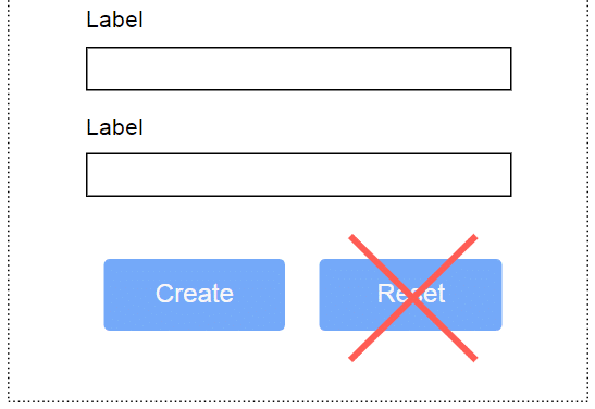
Can you please STOP ADDING RESET BUTTONS to your forms?
 There hasn’t been a single user in the entire history of the interwebs who filled out a web form, and then went, “O wait, all of that isn’t right, I’ve entered the wrong information! What to do, what to do, but pull my hair out in desperation? Oh thank Heavens, there’s a Reset button!”
All of your website visitors will either go, “Oh well, let’s change the bit I entered wrong”, or “Oh well, I don’t want to send this at all, let’s close the tab and/or hit Back”.
On the other hand, there are hundreds of millions of users who’ve painstakingly entered all the information you ask of them in your form, and then clicked Reset by mistake while hunting for Submit.
Those users then have to fill out the form all over again (frustrating for them), or decide not to fill the form out at all (your loss), or defenestrate their laptop in a tantrum (not very sustainable), and in all of these cases will end up hating your guts for your utter lack of UI design savvy.
The fact that the HTML specifications contains the possibilty, doesn’t actually mean you’re under any obligation to include them. Leave them out*.
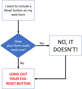
* Or explain to me why you believe the Reset button fills a real UI need. And I’ll explain to your why you are wrong. And then leave them out. I’ve included a convenient flow chart to help you decide.
